Millions of people use GitHub daily for a variety of reasons. Some are users seeking to download software. Some are software developers using it as a source code repository. Others are using it for continuous integration / continuous deployment pipelines. And so on.
Regardless of why you use GitHub, you likely pay little attention to how accessible your contributions to the platform are. This article seeks to make the case for why accessible contributions to GitHub are important and how to make contributions more accessible.
Why should I make GitHub contributions accessible?
Accessibility does not just stop at your consumer facing product and ensuring the users of your product are accommodated. Within the context of GitHub, you do not have a user per se, but accessibility is no less important. Who does it matter to and why?
Your Coworkers
Some of your coworkers and professional colleagues may have disabilities, regardless of whether you are aware of it or not. Ever met a coworker that is color blind? How about one with ADD/ADHD? Dyslexia? Motor impairments?
Coworkers with disabilities likely have a passion for software development and a desire to contribute the same as you or me. Providing them with an accommodating and inclusive way of doing so is a must.
Consumers of Open-Source Projects
How many times have you Googled a question stumping you only to end up clicking on a result that leads to an issue/comment chain in a repository?
What if once getting to that potential answer, you were unable to actually read / understand / see the content because it was inaccessible?
Does that sound discriminatory? It certainly does to me.
Was that anyone’s intent when they created those contributions (e.g., a comment, pull request, issue, etc.)? Probably not, but intent does not change the outcome and we as software developers can do better to accommodate our coworkers and potential target audiences/users.
Forms Good Habits
You have heard the saying: practice makes perfect! That wisdom applies to making your contributions accessible as well. Making your Markdown and GitHub contributions accessible will lead to positive habits that make the software you develop more accessible too.
If you pay attention to alternative text descriptions for images and proper heading levels in your GitHub contributions, you almost certainly do it in the code you develop as well.
This article is not meant to shame anyone or complain. You likely ended up here exactly because you want to understand how to make your GitHub contributions more accessible!
Regardless of how you arrived here, I commend you for reading this far! Now that you are bought in to making your contributions more accessible…
How can I make my GitHub contributions accessible?
GitHub makes use of a modified form of Markdown, which is largely referred to as GitHub Flavored Markdown Spec – or GFM. GFM provides functionality over and above what Markdown typically allows for, some of which makes accessibility a bit simpler to accomplish.
One example of a difference is allowing for semantic <img> elements. Why does that matter? Because <img> elements also allow for the providing of alternative text to the images you post, which is a widely understood concept already. You can also do this in regular Markdown, but more on that in a minute.
Let’s dive into some of the key accessibility considerations that are fully supported via GFM.
Open a pull request, issue, comment, etc.
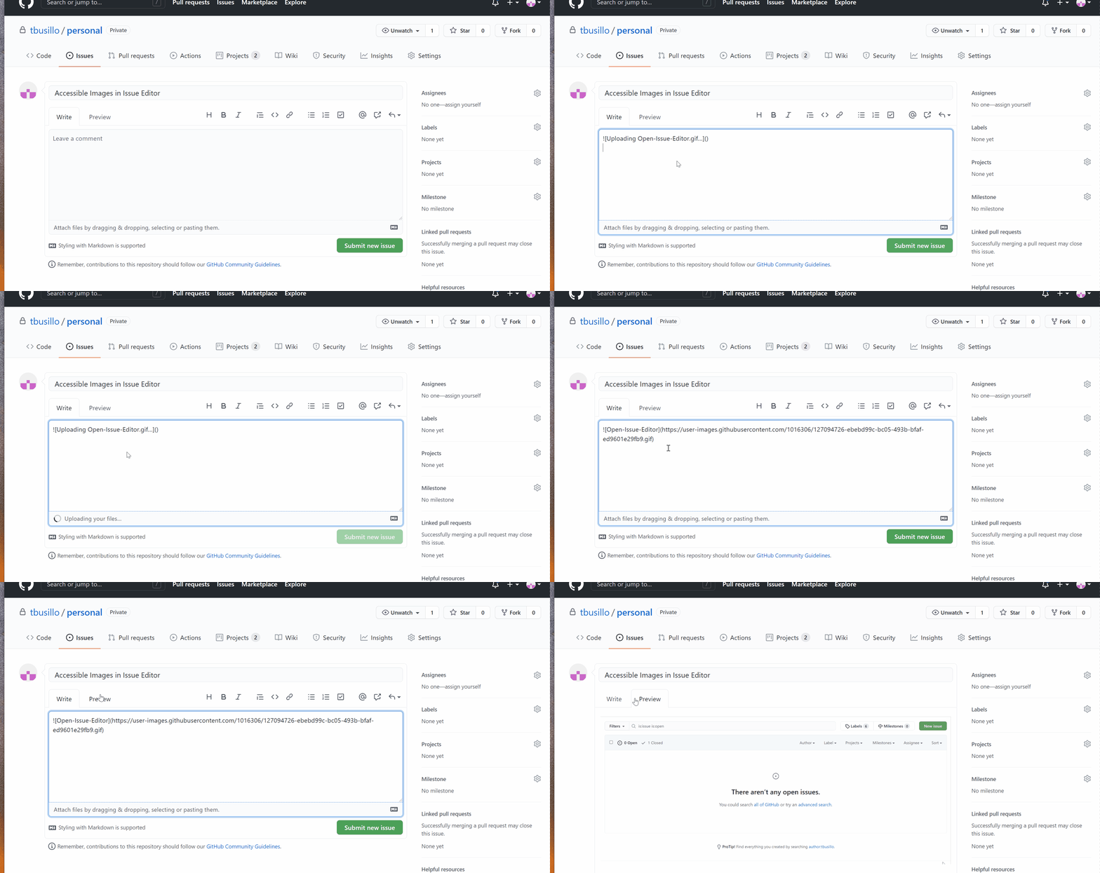
To start, open a new Issue. Opening the issue should bring up a blank text editor with some button controls in it. This editor is more-or-less the same across pull requests, gists, README files, comments, etc. So please feel free to use any of those instead as you follow along.

Notice in the animated .gif above that there are two tabs to the editor – one is editable, the other is a preview of the Markdown we will be creating. If you want to view what your Markdown will look like once rendered, click on the preview tab, then once finished, click back on the “Write” tab to return to editing text.
Accessible Images
Images are often used within GFM, but many are not accessible even though there is functionality in GFM to support it.
Dos and don’ts of images
- Do provide a text description of the image via alternative text functionality.
- Do keep your alternative text description 125 characters or less.
- Do provide descriptive alternative text that serves the equivalent purpose of the image itself.
- Do name your image with something descriptive of the image (e.g., “drag-and-drop-image-into-github-editor.gif” vs. “129eiuf23462.gif”).
- Do not use images of text. Even with alternative descriptions, you only have 255 characters and images of text will likely easily surpass that limitation. Instead of posting a screenshot of console output, copy and paste the input with single or triple backticks.
- Do not provide for blank alternative text description tags on non-decorative images.
- Do not waste characters with phrases such as, “Image of…”, “Picture of…”, etc. It is unnecessary, as the user will already be aware that the alternative text is describing an image/picture.
Linking to Externally Hosted Images
The syntax for embedding an image in Markdown is:

If you leave the portion within the parenthesis blank, the image will render with a blank alternative description tag.
In addition to the Markdown syntax, you can also use semantic <img> tags within the editor. Similar to semantic <img> tag usage in HTML, GFM’s implementation allows for the use of alt=’image description’.
Regardless of the route you take, the output will look something like this:
<img src="https://user-images.githubusercontent.com/1016306/127094726-ebebd99c-bc05-493b-bfaf-ed9601e29fb9.gif" alt="Description of Image" style="max-width:100%;">
Dragging and dropping images into the editor
In addition to linking to an external image, you can also drag and drop images directly into the editor. Doing so will upload the image to GitHub automatically, then embed the URL to the image in the editor. Take a look below to see it in action!

Use proper heading levels
Heading levels are another easy way to make your contributions more accessible. Instead of just bolding with ** text ** * text *
Heading levels can be a bit confusing at times.
Easiest way to remember it is as follows:
Heading Level One <h1>
There should only be one heading level one. It should be the most important heading and serve as effectively the title of the content.
Heading Levels Two Through Six <h2> – <h6>
Headings used after the single <h1> should be in order of importance. I like to think of this as if you were to slice up your content into an outline/bulleted list, the sections you outlined would be your <h2>
Nesting of Headings
Use of headings after <h1> and <h2> will likely be outside of the norm. If you were to slice up your main sections that are <h2>s even further into sub-sections, you would use an <h3>.
To help understand nested headings, see the below headings usage in Markdown / GFM:
# Heading Level One (h1)

## Heading Level Two (h2)

## Heading Level Two (h2)

### Heading Level Three (h3)

### Heading Level Three (h3)

#### Heading Level Four (h4)

## Heading Level Two (h2)
Make Links Descriptive
Use of descriptive URLs that have an understandable purpose in their anchor text is an often-overlooked aspect of content creation in general. Think of all the websites you see using the pattern of “Read More” or “Learn More”.
Now think about all the GitHub content that contains link that say something along the lines of “See the image of this here”, with “here” being a hyperlink to something.
WCAG 2.4.4 – Link Purpose is intended to, “help users understand the purpose of each link so they can decide whether they want to follow the link”.
To create more accessible hyperlinks in GFM, ensure that your text anchor describes the links purpose, title of the content, etc. An example of this looks like:
[Understanding Success Criterion 2.4.4 – Link Purpose (In Context)](https://www.w3.org/WAI/WCAG21/Understanding/link-purpose-in-context.html)
The output of this would be: “Understanding Success Criterion 2.4.4 – Link Purpose (In Context)”.
Use of Ordered and Unordered Lists Properly
Bulleted or numbered lists are commonly used in written content – even this article! Ordered and unordered lists are the way to accomplish bulleted or numbered lists in GFM.
Ordered and unordered lists can help make content clearer and more readable, as well as help to emphasize certain points more succinctly.
As a rule of thumb, ordered lists should be used for sequentially numbered content, whereas unordered lists should be used for non-sequential content.
Here is an example to illustrate the difference:
Ordered List
- List item one
- List item two
- List item three
Unordered List
- Here is a list item
- Here’s some other content
- Not to least of which also includes this
Write with Clarity and Understandability In Mind
Contrary to popular belief, accessibility does not only apply to those with vision, hearing, or motor impairments. It is also intended for those with cognitive, learning, and neurological disabilities as well (e.g., ADD/ADHD, Autism Spectrum Disorder, memory impairments, etc.).
According to the Web Accessibility Initiative, people with cognitive, learning, and neurological disabilities, may rely upon:
- Clearly structured content that facilitates overview and orientation;
- Consistent labeling of forms, buttons, and other content parts;
- Predictable link targets, functionality, and overall interaction;
- Different ways of navigating websites, such as hierarchical menu and search;
- Options to suppress blinking, flickering, flashing, and otherwise distracting content;
- Simpler text that is supplemented by images, graphs, and other illustrations;
In other words, do not make your content or contribution overly complicated, make it consistent (e.g., standard formatting and templates for PRs / issues), etc.
Conclusion
Well, that is a wrap and I know there was a ton of information packed into one article. If you’re feeling a bit lost or overwhelmed, just remember that even the best and most informed get things wrong at times (including – or especially – me).
Best advice I can offer is to do your best and ask questions if you have them! I am likely missing some of the accessibility features of Markdown / GFM and may have even made some accessibility mistakes / errors.
Please feel free to comment below or contact us with your additions and critiques and please stay tuned for my next article on this topic, which will cover the accessibility features in Jira and Confluence!


